Welcome to this post trailblazers. What is Modal/Popup in LWC in Salesforce?
In this post, We will simply create a custom Modal/Popup Box in the lightning web component(LWC).
Table of Contents
What is Modal in Salesforce Lightning Experience?
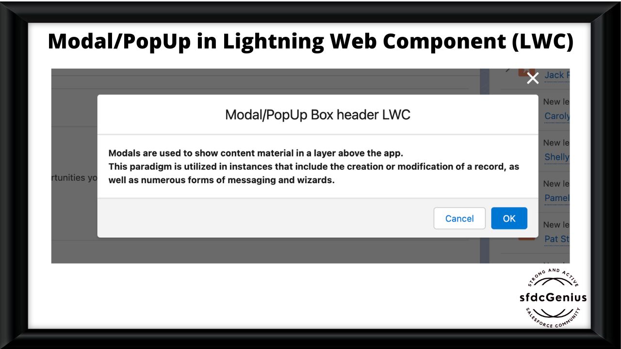
Modals are used to show content material in a layer above the app. This paradigm is utilized in instances that include the creation or modification of a record, as well as numerous forms of messaging and wizards.
Modal/Popup Lightning Web Component(LWC) Salesforce looks like the following image

Basic Modal/Popup in LWC
In this code, we’re first declaring the ‘isModalOpen’ attribute and putting its default value as false. Then using a template if: true we’re conditionally showing a modal/popup on click on the button.
Also, code has the following 3 most important part
- section
- header
- footer
Details are defined in the below code. Following is the expected markup
Expected markup in modal/popup
- Modal has
role="dialog" - When the modal is open, everything behind it has an HTML attribute
aria-hidden="true", so assistive technology won’t read out the underlying page. The best way to do this is to give the modal and the page separate wrapper elements and togglearia-hidden="true"/aria-hidden="false"on the main page’s wrapper depending on whether or not the modal is open. - Modal contains an HTML heading.
- Modal has an
aria-labelledbyattribute whose value is the id of the modal’s heading.
do you know the LWC life cycle? Lightning Web Component Life Cycle
modalPopupLWC.html
<template>
    <!-- lightning button for open modal window -->
    <lightning-button variant="brand"
       label="What is Modal/PopUp in LWC?"
       title="What is Modal/PopUp in LWC?"
       onclick={openModal}
       class="slds-m-left_x-small">
    </lightning-button>
    <!--Use template if:true to display/hide popup based on isModalOpen value-->
    <template if:true={isModalOpen}>
        <!-- Modal/Popup Box LWC starts here -->
        <section role="dialog" tabindex="-1" aria-labelledby="modal-heading-01" aria-modal="true" aria-describedby="modal-content-id-1" class="slds-modal slds-fade-in-open">
            <div class="slds-modal__container">
                <!-- Modal/Popup Box LWC header here -->
                <header class="slds-modal__header">
                    <button class="slds-button slds-button_icon slds-modal__close slds-button_icon-inverse" title="Close" onclick={closeModal}>
                        <lightning-icon icon-name="utility:close"
                            alternative-text="close"
                            variant="inverse"
                            size="small" ></lightning-icon>
                        <span class="slds-assistive-text">Close</span>
                    </button>
                    <h2 id="modal-heading-01" class="slds-text-heading_medium slds-hyphenate">Modal/PopUp Box header LWC</h2>
                </header>
                <!-- Modal/Popup Box LWC body starts here -->
                <div class="slds-modal__content slds-p-around_medium" id="modal-content-id-1">
                    <p><b>Modals are used to show content material in a layer above the app.
                    </b></p>
                    <p><b>This paradigm is utilized in instances that include the creation or modification of a record, as well as numerous forms of messaging and wizards.

                    </b></p>

                </div>
                <!-- Modal/Popup Box LWC footer starts here -->
                <footer class="slds-modal__footer">
                    <button class="slds-button slds-button_neutral" onclick={closeModal} title="Cancel">Cancel</button>
                    <button class="slds-button slds-button_brand" onclick={submitDetails} title="OK">OK</button>
                </footer>
            </div>
        </section>
        <div class="slds-backdrop slds-backdrop_open"></div>
    </template>
 </template>
modalPopupLWC.js
import { LightningElement,track } from 'lwc';
export default class ModalPopupLWC extends LightningElement {
    //Boolean tracked variable to indicate if modal is open or not default value is false as modal is closed when page is loaded
    @track isModalOpen = false;
    openModal() {
        // to open modal set isModalOpen tarck value as true
        this.isModalOpen = true;
    }
    closeModal() {
        // to close modal set isModalOpen tarck value as false
        this.isModalOpen = false;
    }
    submitDetails() {
        // to close modal set isModalOpen tarck value as false
        //Add your code to call apex method or do some processing
        this.isModalOpen = false;
    }
}
modalPopupLWC.js-meta.xml
<?xml version="1.0" encoding="UTF-8"?>
<LightningComponentBundle xmlns="http://soap.sforce.com/2006/04/metadata">
    <apiVersion>55.0</apiVersion>
    <isExposed>true</isExposed>
    <targets>
        <target>lightning__AppPage</target>
        <target>lightning__RecordPage</target>
        <target>lightning__HomePage</target>
    </targets></LightningComponentBundle>
Now we will upload this lwc component on the home page.
- Go to the Home page
- Click Setup (Gear Icon) and select Edit Page.
- Under Custom Components, find your modalPopupLWC component and drag it at the right-hand side top.
- Click Save and activate.
You will see the button on the home page. After clicking the button you will see a popup as shown in the picture above.
More details about lightning modal/popup
Modals always have the same amount of space on the top and bottom to account for the height of the close button.
Modals grow according to how much content is within, however as soon as the modal reaches complete height (such as the previously mentioned area on top and bottom), the content area will start to scroll. (This scrolling is presently not available in Salesforce1 Mobile.)
For extra information about modals in lightning, please refer to modal lightning.


Comment on “What is Modal/Popup in Lightning Web Component(LWC)?”